


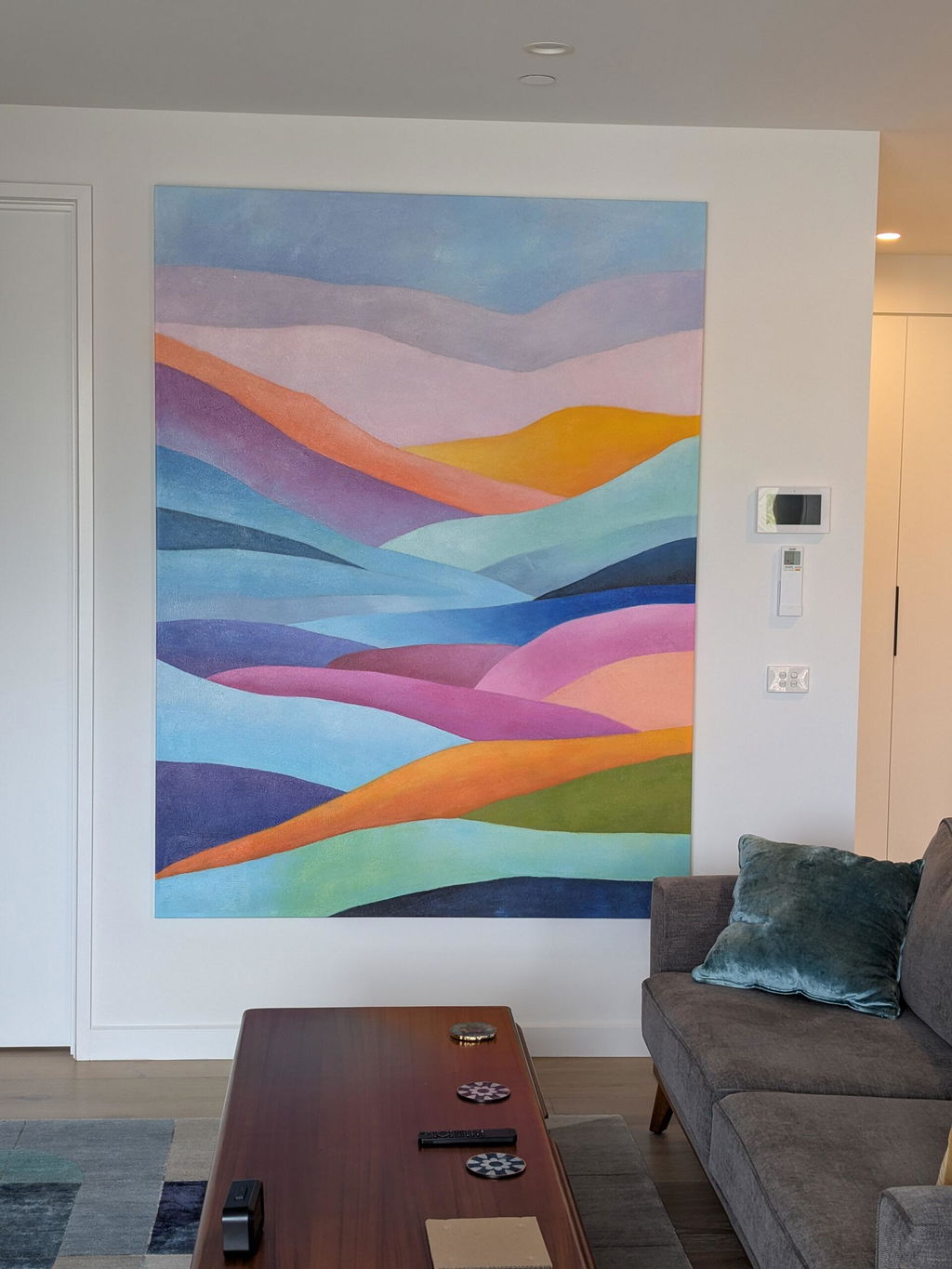
We are extremely pleased with the way our oil rendition Garden of Stillness turned out. It adds so much colour and vibrance to the room
I usually go for earthy landscape themes. The sense of a quiet horizon would be a welcome pause in a busy living space
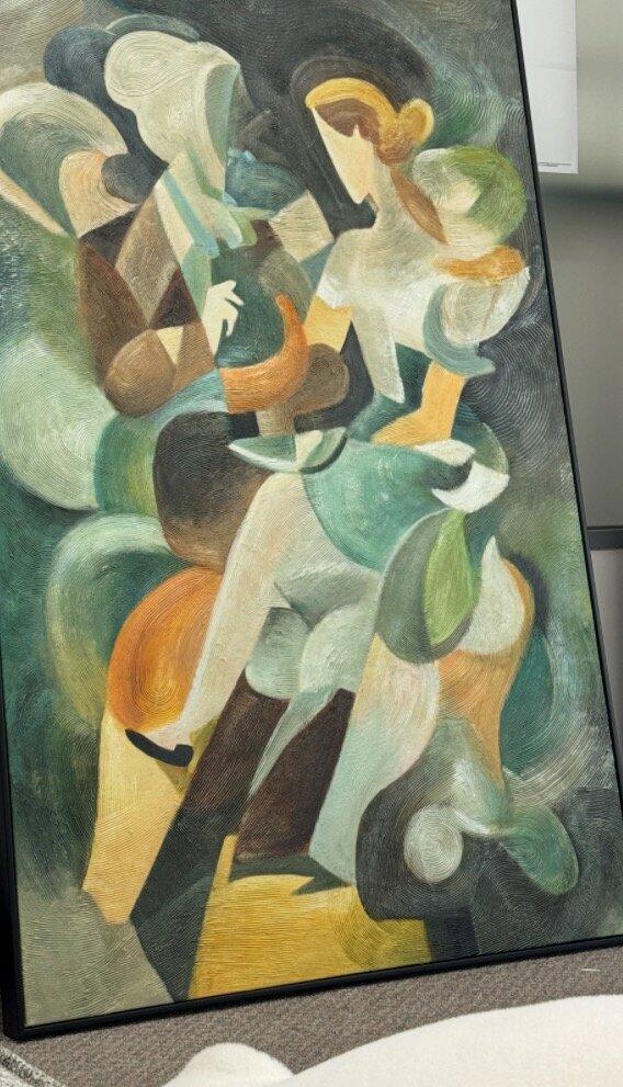
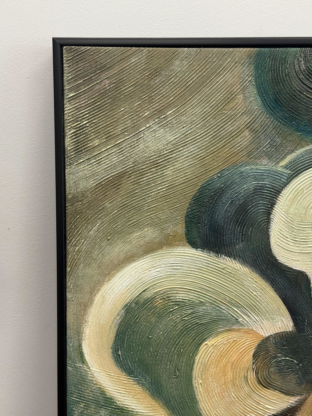
Colour, books and a few mismatched favourite things. This is the kind of idea that makes sense to me
Love a coastal idea that doesn't need shells everywhere lol. Linen and light timber would be enough
Love the earthy feel. Could see it with an oak table and a comfy linen sofa
Love the earthy feel. Could see it with an oak table and a comfy linen sofa
Blue and flowers is such a nice combo. Easy to picture against a white wall
Love my canvas
Really like the amber-and-horizon idea. A little warmth would make all the difference in a pale, neutral room.
I like green-inspired compositions. This theme would pair nicely with a few indoor plants and simple furniture.
The prism-and-rhythm idea feels full of energy. It would be my pick for a creative space that can take a little more colour
A soft floral touch sounds perfect for a neutral corner. I like the thought of something gentle that still gives the room a little personality
This hand-painted abstract work uses whimsical curves of gold, dark green, white and black to evoke tranquil movement and luxury. In the largest sized canvas, it brings vibrant colour and life to the space.
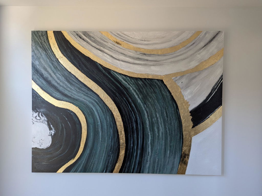
Simple and restful. A still-horizon theme is just what I'd look for beside a reading chair
The cloud-and-bloom idea feels light and gentle. Just the kind of mood I'd try for a quiet bedroom
Got this artwork and it looks great in the living room. It fits the cabinet really well and the colours work nicely with the space.
Looks better in real life, and the texture makes it feel more special. It just makes the room feel more finished and put together.
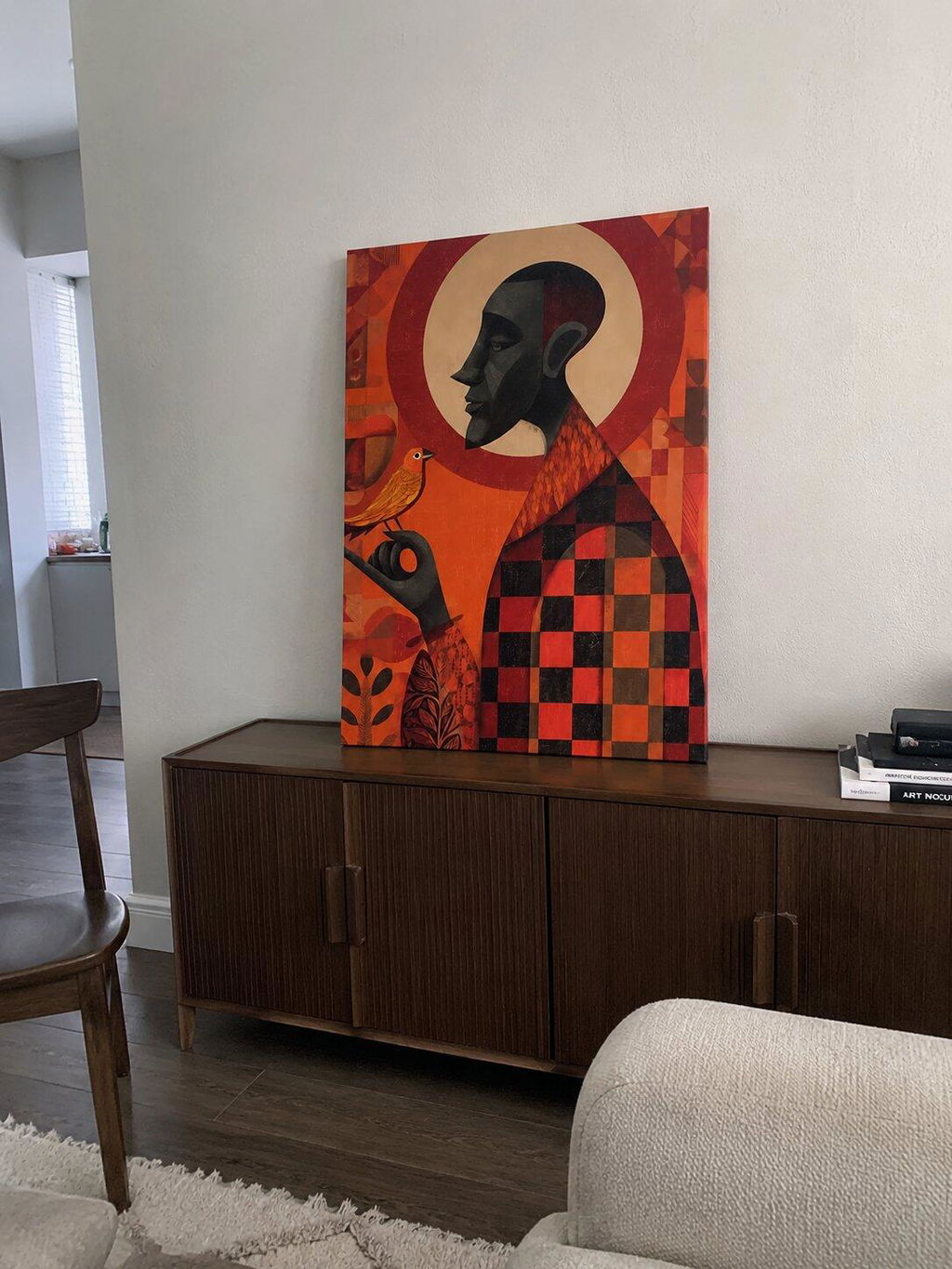
The texture looks great in person and the colours feel warm but not too strong. Leaning it against the wall actually looks very natural in the space.
Overall, it’s a simple piece but really changes the feel of the room in a good way.
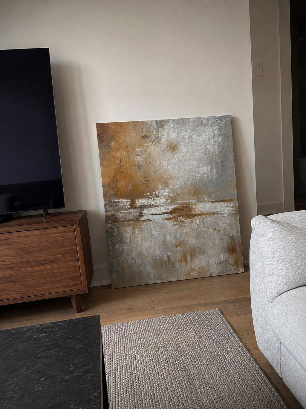
Really happy with this painting after receiving it. It looks even better in person and fits nicely in the room.
The colours are soft and calming, and it works really well with the space. Even just leaning against the wall, it already adds a nice atmosphere to the room. The texture also feels very nice up close — it’s one of those pieces that grows on you the more you look at it.
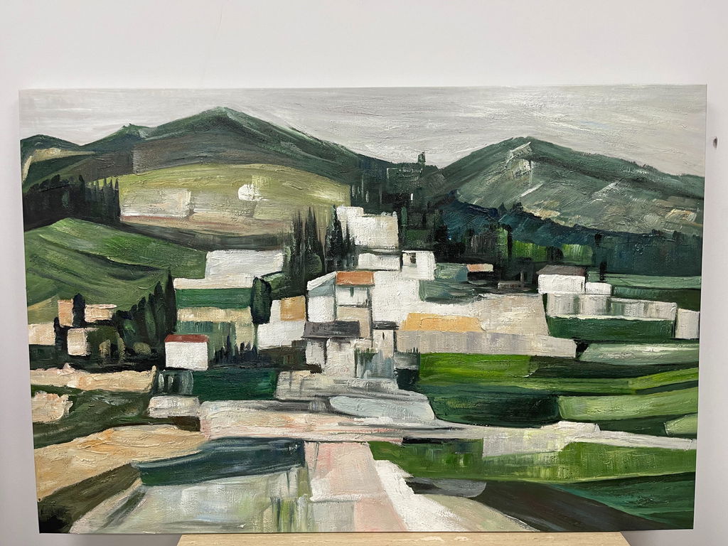
Really happy with the piece after receiving it — it looks even better in person than expected.
The green tones feel very calming, and the layered mountain scene gives a nice sense of depth. It doesn’t overpower the space, but still stands out in a subtle way. Up close, you can really see the brushstrokes and texture, which makes it feel very handmade and authentic.
Overall, it has a very peaceful, natural feel — the kind of artwork that quietly grows on you the longer you live with it.
The architectural theme catches my attention. I like a sense of structure, especially alongside furniture with clean lines
Crimson is a confident choice, and that is exactly what is my kind of thing here. I'd give a piece like this its own space
